ChurchServe Angular Tutorial Part 2: Components, Inputs, and Outputs
Part 1 gave ChurchServe an application shell and lazy routes, but its schedule route still displays placeholder copy. In this part, we will replace that placeholder with a real schedule screen. We will model church events, render them through a reusable card, and let the page respond when someone selects an event.
This tutorial starts from the completed Part 1 application. Every new or changed file required for the Part 2 result is included below.
Quick answer: Pass immutable event data into a focused presentational component with a signal input, emit user intent through an output, and keep collection and selection state in the owning page. Test both the reusable component contract and the page-level interaction.
What You Will Build
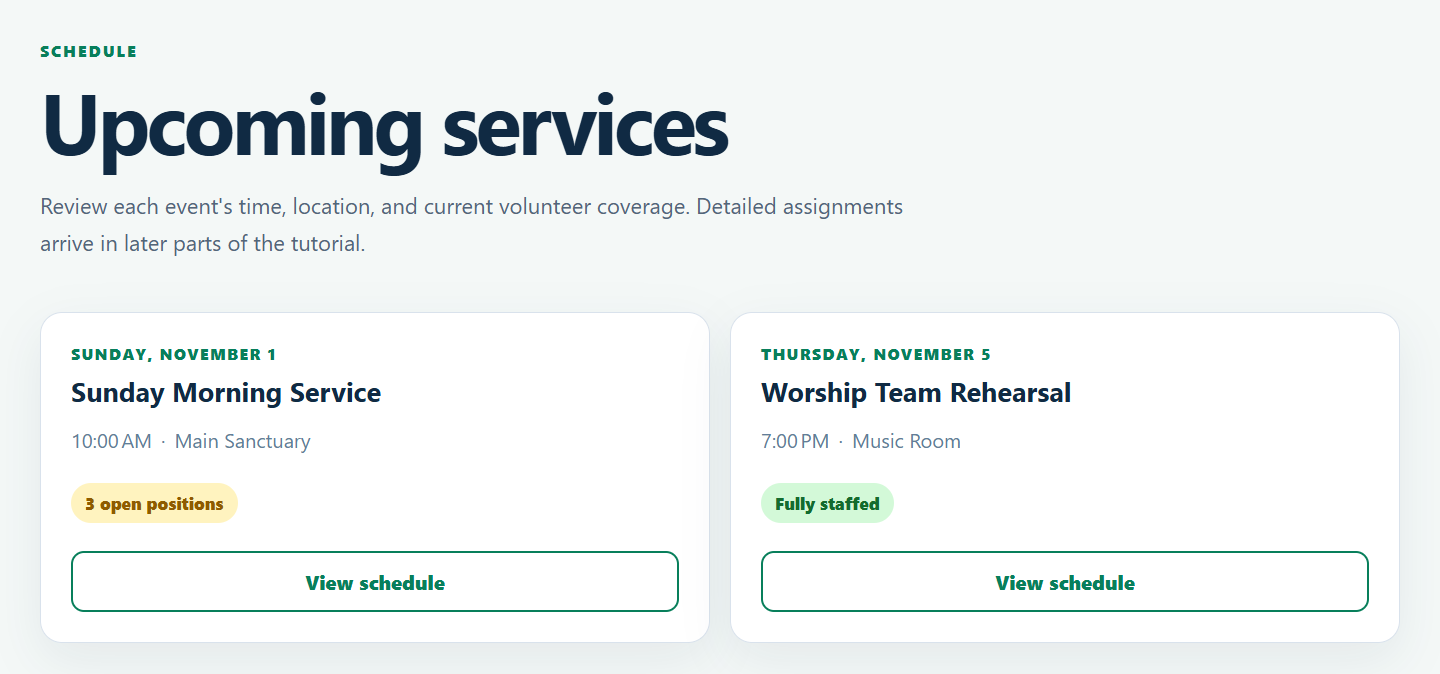
The completed schedule route displays two service-event cards:
- Sunday Morning Service has three open positions.
- Worship Team Rehearsal is fully staffed.
- Each card receives its event from the schedule page.
- Selecting a card emits only the event ID.
- The schedule page owns the selected-event state and displays a confirmation message.
The application will have this schedule feature structure when you finish:
src/app/features/schedule/
├── service-event-card/
│   ├── service-event-card.html
│   ├── service-event-card.scss
│   ├── service-event-card.spec.ts
│   └── service-event-card.ts
├── schedule.html
├── schedule.scss
├── schedule.spec.ts
├── schedule.ts
└── service-event.ts
Angular 22 creates standalone components by default, so the component metadata below does not need standalone: true.
Prepare the Schedule Feature
Open a terminal in the ChurchServe workspace created in Part 1:
cd ChurchServeCode language: Bash (bash)Create the card directory if it does not exist:
mkdir src/app/features/schedule/service-event-cardCode language: Bash (bash)On PowerShell, the same command works because mkdir is an alias for New-Item -ItemType Directory. If the directory already exists, leave it in place.
Part 1 already registered the /schedule lazy route, so no route configuration changes are needed in this part.
Model a Service Event
Create src/app/features/schedule/service-event.ts:
export interface ServiceEvent {
  readonly id: string;
  readonly title: string;
  readonly startsAt: string;
  readonly endsAt: string;
  readonly location: string;
  readonly requiredPositions: number;
  readonly assignedPositions: number;
}Code language: TypeScript (typescript)
The interface gives the page and card one shared contract. Its properties are readonly because a component should not quietly mutate an event received from another owner.
The timestamps are ISO strings rather than preformatted labels. Storage and API formats should remain independent of presentation. Angular's DatePipe will format the start time for the current locale when the card renders.
The two position counts create the first useful business signal in ChurchServe:
open positions = required positions - assigned positionsThese summary values keep Part 2 focused on component communication. A later tutorial will introduce the position and assignment records from which a production application can derive the counts.
Create the Service-Event Card Class
Create src/app/features/schedule/service-event-card/service-event-card.ts:
import { DatePipe } from '@angular/common';
import { ChangeDetectionStrategy, Component, computed, input, output } from '@angular/core';
import { ServiceEvent } from '../service-event';

@Component({
  selector: 'app-service-event-card',
  imports: [DatePipe],
  templateUrl: './service-event-card.html',
  styleUrl: './service-event-card.scss',
  changeDetection: ChangeDetectionStrategy.OnPush,
})
export class ServiceEventCard {
  readonly event = input.required<ServiceEvent>();
  readonly selected = output<string>();

  protected readonly openPositions = computed(() =>
    Math.max(0, this.event().requiredPositions - this.event().assignedPositions),
  );

  protected selectEvent(): void {
    this.selected.emit(this.event().id);
  }
}Code language: TypeScript (typescript)
This class has three small responsibilities:
eventrequires the parent to provide aServiceEvent.openPositionsderives display state whenever that input changes.selectedtells the parent that a user selected an event.
The output contains an ID instead of the entire event. It communicates intent without handing mutable page state back through the component boundary.
Math.max(0, ...) prevents the UI from displaying a negative number when temporarily inconsistent data reports more assignments than requirements. This is a presentation safeguard, not domain validation. The API and command layer will eventually reject or surface invalid staffing data.
ChangeDetectionStrategy.OnPush fits the component's explicit reactive inputs. It also helps keep future performance work predictable, but it is not a substitute for profiling.
Add the Card Template
Create src/app/features/schedule/service-event-card/service-event-card.html:
<article class="event-card">
  <div class="event-copy">
    <p class="event-date">
      <time [attr.datetime]="event().startsAt">
        {{ event().startsAt | date: 'EEEE, MMMM d' }}
      </time>
    </p>
    <h2>{{ event().title }}</h2>
    <p class="event-meta">
      <time [attr.datetime]="event().startsAt">
        {{ event().startsAt | date: 'shortTime' }}
      </time>
      <span aria-hidden="true">·</span>
      <span>{{ event().location }}</span>
    </p>
  </div>

  @if (openPositions() === 0) {
    <p class="staffing complete">Fully staffed</p>
  } @else {
    <p class="staffing open">
      {{ openPositions() }} open {{ openPositions() === 1 ? 'position' : 'positions' }}
    </p>
  }

  <button type="button" (click)="selectEvent()" [attr.aria-label]="'View ' + event().title">
    View schedule
  </button>
</article>Code language: HTML, XML (xml)
The native <article>, <time>, heading, and <button> elements carry useful semantics without custom keyboard behavior. The date remains machine-readable through datetime, while DatePipe produces readable text.
The staffing branch handles both fully staffed and open events. The nested expression also prevents the grammatically incorrect “1 positions” label.
The visible button text is deliberately short. Its accessible name includes the event title so screen-reader users do not encounter several unrelated buttons all announced only as “View schedule.”
Style the Card
Create src/app/features/schedule/service-event-card/service-event-card.scss:
.event-card {
  display: grid;
  height: 100%;
  padding: 1.5rem;
  border: 1px solid #d9e2ec;
  border-radius: 1.1rem;
  background: #fff;
  box-shadow: 0 0.9rem 2.5rem rgba(16, 42, 67, 0.07);
  gap: 1.4rem;
  grid-template-rows: 1fr auto auto;
}

.event-date {
  margin: 0 0 0.55rem;
  color: #087f5b;
  font-size: 0.78rem;
  font-weight: 800;
  letter-spacing: 0.1em;
  text-transform: uppercase;
}

h2 {
  margin: 0;
  color: #102a43;
  font-size: 1.35rem;
  line-height: 1.25;
}

.event-meta {
  display: flex;
  flex-wrap: wrap;
  margin: 0.8rem 0 0;
  color: #627d98;
  gap: 0.45rem;
  line-height: 1.5;
}

.staffing {
  width: fit-content;
  margin: 0;
  padding: 0.45rem 0.7rem;
  border-radius: 999px;
  font-size: 0.85rem;
  font-weight: 800;
}

.staffing.open {
  background: #fff3bf;
  color: #8f5b00;
}

.staffing.complete {
  background: #d3f9d8;
  color: #146c2e;
}

button {
  width: 100%;
  padding: 0.75rem 1rem;
  border: 2px solid #087f5b;
  border-radius: 0.65rem;
  background: #fff;
  color: #087f5b;
  cursor: pointer;
  font-weight: 800;
}

button:hover {
  background: #e6fcf5;
}

button:focus-visible {
  outline: 3px solid #74c0fc;
  outline-offset: 3px;
}Code language: SCSS (scss)
The card uses a three-row grid so its title area can grow without pushing the staffing badge and button into inconsistent positions. The explicit focus outline remains visible for keyboard navigation.
The open and complete states use more than color: their text also says “open positions” or “Fully staffed.” Users therefore do not need to distinguish yellow from green to understand the state.
Test the Card Contract
Create src/app/features/schedule/service-event-card/service-event-card.spec.ts:
import { TestBed } from '@angular/core/testing';
import { ServiceEvent } from '../service-event';
import { ServiceEventCard } from './service-event-card';

describe('ServiceEventCard', () => {
  const event: ServiceEvent = {
    id: 'event-1',
    title: 'Sunday Morning Service',
    startsAt: '2026-11-01T10:00:00-05:00',
    endsAt: '2026-11-01T11:30:00-05:00',
    location: 'Main Sanctuary',
    requiredPositions: 10,
    assignedPositions: 7,
  };

  it('renders the event and open-position count', () => {
    const fixture = TestBed.createComponent(ServiceEventCard);
    fixture.componentRef.setInput('event', event);
    fixture.detectChanges();

    const text = fixture.nativeElement.textContent;
    expect(text).toContain('Sunday Morning Service');
    expect(text).toContain('Main Sanctuary');
    expect(text).toContain('3 open positions');
  });

  it('emits the event ID when selected', () => {
    const fixture = TestBed.createComponent(ServiceEventCard);
    fixture.componentRef.setInput('event', event);
    const selected: string[] = [];
    fixture.componentInstance.selected.subscribe((id) => selected.push(id));
    fixture.detectChanges();

    fixture.nativeElement.querySelector('button').click();

    expect(selected).toEqual(['event-1']);
  });

  it('shows when an event is fully staffed', () => {
    const fixture = TestBed.createComponent(ServiceEventCard);
    fixture.componentRef.setInput('event', {
      ...event,
      assignedPositions: event.requiredPositions,
    });
    fixture.detectChanges();

    expect(fixture.nativeElement.textContent).toContain('Fully staffed');
    expect(fixture.nativeElement.textContent).not.toContain('open positions');
  });
});Code language: TypeScript (typescript)
componentRef.setInput is the appropriate way to supply a signal input in a focused component test. It follows Angular's input lifecycle rather than reaching into implementation details.
These three tests protect the card's public behavior: domain data is visible, the derived staffing state is correct, and clicking emits the event ID. They intentionally do not access the protected computed signal directly.
Make the Schedule Page the Owner
Replace src/app/features/schedule/schedule.ts with:
import { ChangeDetectionStrategy, Component, computed, signal } from '@angular/core';
import { ServiceEventCard } from './service-event-card/service-event-card';
import { ServiceEvent } from './service-event';

@Component({
  selector: 'app-schedule',
  imports: [ServiceEventCard],
  templateUrl: './schedule.html',
  styleUrl: './schedule.scss',
  changeDetection: ChangeDetectionStrategy.OnPush,
})
export class Schedule {
  protected readonly events = signal<readonly ServiceEvent[]>([
    {
      id: 'sunday-2026-11-01',
      title: 'Sunday Morning Service',
      startsAt: '2026-11-01T10:00:00-05:00',
      endsAt: '2026-11-01T11:30:00-05:00',
      location: 'Main Sanctuary',
      requiredPositions: 10,
      assignedPositions: 7,
    },
    {
      id: 'rehearsal-2026-11-05',
      title: 'Worship Team Rehearsal',
      startsAt: '2026-11-05T19:00:00-05:00',
      endsAt: '2026-11-05T20:30:00-05:00',
      location: 'Music Room',
      requiredPositions: 6,
      assignedPositions: 6,
    },
  ]);

  private readonly selectedEventId = signal<string | null>(null);

  protected readonly selectedEvent = computed(() =>
    this.events().find((event) => event.id === this.selectedEventId()),
  );

  protected selectEvent(id: string): void {
    this.selectedEventId.set(id);
  }
}Code language: TypeScript (typescript)
The schedule page owns both the collection and the selected ID. The card has no knowledge of its siblings or of what selection means to the page.
The collection signal is typed as readonly ServiceEvent[]. That prevents accidental mutation through methods such as push. Later parts can replace the array with data from a repository while preserving the card contract.
selectedEvent derives the complete event from the selected ID. For now, the page uses it to display a confirmation. A later route tutorial can change that response to navigation without redesigning the card.
Keeping Part 2 local is intentional: navigating to /schedule/:id here would lead to a route that has not been implemented yet.
Replace the Schedule Template
Replace src/app/features/schedule/schedule.html with:
<section class="schedule-page" aria-labelledby="schedule-heading">
  <p class="eyebrow">Schedule</p>
  <h1 id="schedule-heading">Upcoming services</h1>
  <p class="introduction">
    Review each event's time, location, and current volunteer coverage. Detailed assignments arrive
    in later parts of the tutorial.
  </p>

  <div class="event-grid">
    @for (event of events(); track event.id) {
      <app-service-event-card [event]="event" (selected)="selectEvent($event)" />
    }
  </div>

  @if (selectedEvent(); as event) {
    <p class="selection-status" role="status">
      <strong>{{ event.title }}</strong> selected. Detailed scheduling will be added in a later
      part.
    </p>
  }
</section>Code language: HTML, XML (xml)
The parent supplies each [event] input and handles each (selected) output. That line shows Angular's one-way component contract in both directions without sharing mutable state.
track event.id preserves the relationship between an event and its DOM node if a later update reorders or replaces the collection.
The confirmation uses role="status". Assistive technology can announce the result after the button click without moving keyboard focus away from the button.
Style the Schedule Page
Create src/app/features/schedule/schedule.scss:
:host {
  display: block;
}

.schedule-page {
  max-width: 76rem;
  margin: 0 auto;
  padding: clamp(3.5rem, 8vw, 6rem) clamp(1.25rem, 5vw, 4rem);
}

.eyebrow {
  margin: 0 0 0.8rem;
  color: #087f5b;
  font-size: 0.78rem;
  font-weight: 800;
  letter-spacing: 0.14em;
  text-transform: uppercase;
}

h1 {
  margin: 0;
  color: #102a43;
  font-size: clamp(2.4rem, 6vw, 4.25rem);
  letter-spacing: -0.045em;
  line-height: 1;
}

.introduction {
  max-width: 44rem;
  margin: 1.25rem 0 0;
  color: #52667a;
  font-size: 1.1rem;
  line-height: 1.7;
}

.event-grid {
  display: grid;
  margin-top: 2.5rem;
  gap: 1rem;
  grid-template-columns: repeat(auto-fit, minmax(min(100%, 18rem), 1fr));
}

.selection-status {
  margin: 1.25rem 0 0;
  padding: 0.9rem 1rem;
  border-left: 4px solid #087f5b;
  background: #e6fcf5;
  color: #245448;
  line-height: 1.5;
}Code language: SCSS (scss)
The auto-fit grid can display the cards side by side when space allows and collapse to one column on a narrow screen. min(100%, 18rem) prevents the minimum card width from forcing horizontal scrolling on a viewport narrower than 18 rem.
Test the Page-Level Interaction
Create src/app/features/schedule/schedule.spec.ts:
import { TestBed } from '@angular/core/testing';
import { Schedule } from './schedule';

describe('Schedule', () => {
  it('renders the event collection and owns card selection', () => {
    const fixture = TestBed.createComponent(Schedule);
    fixture.detectChanges();

    const element: HTMLElement = fixture.nativeElement;
    expect(element.querySelectorAll('app-service-event-card')).toHaveLength(2);

    element.querySelector<HTMLButtonElement>('app-service-event-card button')?.click();
    fixture.detectChanges();

    expect(element.querySelector('[role="status"]')?.textContent).toContain(
      'Sunday Morning Service selected',
    );
  });
});Code language: TypeScript (typescript)
The card tests prove the child emits an ID. This page test proves the parent receives that output and translates it into visible page state. Together they cover the boundary without testing private fields.
Run the Unit Tests
Run the suite once and return to the command prompt:
npm test -- --watch=falseCode language: Bash (bash)At this checkpoint, the Part 1 tests and the four new Part 2 tests should all pass. The exact number may be higher if you have added your own tests.
If PowerShell says that ng is not recognized, use the npm command above. It invokes the project-local Angular CLI installed in node_modules, so a global Angular CLI installation is not required.
The fixed ISO timestamps include a Toronto offset. The exact text produced by DatePipe can vary by runtime locale, which is why the tests assert stable business text rather than one specific formatted date string.
Build and Run the Application
Compile the production configuration:
npm run buildCode language: Bash (bash)Then start the development server:
npm startCode language: Bash (bash)Open the local URL printed by Angular, normally http://localhost:4200, and select Schedule in the primary navigation. If port 4200 is already occupied, choose another port:
npm start -- --port 4201Code language: Bash (bash)Select either View schedule button. A status message should appear below the cards and identify the selected event.
Part 2 Checkpoint
ChurchServe now renders typed domain data through a reusable component with explicit input and output contracts. The page owns the collection and selection state, while the card owns only event presentation and the click interaction.
Part 3 will build on these same files by modeling loading, error, empty, and populated schedule states with Angular's built-in control flow.
Confirm Your Result
Open /schedule and compare your application with the completed Part 2 screen below. You should see two responsive event cards, three open positions for Sunday Morning Service, a fully staffed Worship Team Rehearsal, and a visible keyboard focus treatment on each button.
Click View schedule on the first card and confirm that a status message names Sunday Morning Service. Then run npm test -- --watch=false and npm run build. Part 2 is complete when the interaction works, all tests pass, and the production build succeeds.