ChurchServe Angular Tutorial Part 1: Create the Application Shell
ChurchServe is a volunteer and ministry scheduling application for churches. Coordinators will create services, define required ministry positions, assign available volunteers, and identify gaps before a schedule is released. Volunteers will eventually manage availability, accept assignments, and request substitutes.
This series builds that application once. The beginner lessons use local data, the intermediate lessons connect the same screens to an API, and the advanced lessons add concurrency, security, accessibility, performance, deployment, and diagnostics.
Quick answer: Create a strict standalone Angular application with routing, keep the root component focused on the application frame, and verify the visible title and navigation with tests before adding domain features.
Define the First Boundary
The first release is intentionally small. It does not contain donations, payment processing, pastoral notes, attendance surveillance, or detailed information about children. Those areas carry financial, privacy, and safeguarding obligations that would distract from the scheduling problem.
ChurchServe begins with four concepts:
| Concept | Purpose |
|---|---|
| Service event | A worship service, rehearsal, youth night, or community event |
| Ministry position | A required role such as greeter, sound operator, or vocalist |
| Volunteer | A person eligible to serve in one or more ministries |
| Assignment | A volunteer filling one position for one event |
Keeping this vocabulary stable will make later refactoring meaningful rather than arbitrary.
Install the Prerequisites
Angular development happens through Node.js tooling. You need three things before creating ChurchServe:
- A supported Node.js release, which includes the
noderuntime. - npm, the package manager installed with Node.js.
- Angular CLI, which can run locally through
npxor be installed globally as thengcommand.
Install Node.js and npm
Download an LTS release from the official Node.js download page. Angular requires a supported Node.js version; for the Angular 22.2 workspace used in this series, Node.js 24 LTS is a suitable choice. Avoid an end-of-life release even if it can start the application.
The Windows installer includes npm. Close and reopen PowerShell after installation so the updated PATH is available, then verify both commands:
node --version
npm --versionCode language: Bash (bash)
Each command should print a version instead of a “not recognized” or “command not found” error. A Node version manager is useful when different projects require different Node releases, but it is optional for this tutorial.
Choose How to Run Angular CLI
Angular's documentation commonly installs the CLI globally:
npm install --global @angular/cli@22.2.3
ng versionCode language: Bash (bash)
A global installation makes ng available from any directory. If PowerShell reports that ng is not recognized, the CLI is not installed globally or its npm global directory is not on PATH.
This tutorial uses the project-local CLI whenever possible. npx can run a pinned CLI version to create the workspace, and npm scripts automatically find the CLI installed inside that workspace. This avoids a global CLI silently changing the version used by the tutorial.
npx --yes @angular/cli@22.2.3 versionCode language: Bash (bash)You therefore do not need a global Angular installation to follow the series. After the project exists, prefer npm start, npm test, and npm run build. See the official Angular installation guide for current platform and version requirements.
Create the Workspace
Create the application with strict checking, routing, standalone components, and SCSS:
npx --yes @angular/cli@22.2.3 new churchserve --standalone --routing --style=scss --strict
cd churchserve
npm startCode language: Bash (bash)
Pin the generated Angular and Node versions in the repository documentation and lockfile. Following “latest” without recording a version makes older tutorial checkpoints difficult to reproduce.
Angular 22 generates concise filenames such as app.ts and app.html. Older Angular projects often use names such as app.component.ts; do not mix the two conventions while following this tutorial.
Generate the three feature components from inside the new churchserve directory:
npx ng generate component features/home --skip-tests
npx ng generate component features/schedule --skip-tests
npx ng generate component features/volunteers --skip-testsCode language: Bash (bash)
After replacing the generated placeholder content, the files used in Part 1 are:
src/
  app/
    features/
      home/
        home.ts
        home.html
        home.scss
        home.spec.ts
      schedule/
        schedule.ts
        schedule.html
      volunteers/
        volunteers.ts
        volunteers.html
      placeholder-page.scss
    app.config.ts
    app.html
    app.routes.ts
    app.scss
    app.spec.ts
    app.ts
  index.html
  main.ts
  styles.scss
The generated main.ts already bootstraps App with appConfig, and app.config.ts already calls provideRouter(routes). Confirm the latter still contains the router provider:
import { ApplicationConfig, provideBrowserGlobalErrorListeners } from '@angular/core';
import { provideRouter } from '@angular/router';
import { routes } from './app.routes';

export const appConfig: ApplicationConfig = {
  providers: [provideBrowserGlobalErrorListeners(), provideRouter(routes)],
};Code language: TypeScript (typescript)
Build the Root Shell
The root component owns only the application frame. Replace src/app/app.ts with:
import { ChangeDetectionStrategy, Component } from '@angular/core';
import { RouterLink, RouterLinkActive, RouterOutlet } from '@angular/router';

@Component({
  imports: [RouterLink, RouterLinkActive, RouterOutlet],
  selector: 'app-root',
  styleUrl: './app.scss',
  templateUrl: './app.html',
  changeDetection: ChangeDetectionStrategy.OnPush,
})
export class App {
  protected readonly applicationName = 'ChurchServe';
}Code language: TypeScript (typescript)
Standalone components are the default in Angular 22, so this generated style does not need standalone: true. The router directives are listed explicitly because the template uses them.
Replace src/app/app.html with the accessible frame:
<a class="skip-link" href="#main-content">Skip to main content</a>

<header class="site-header">
  <a routerLink="/" class="brand" aria-label="ChurchServe home">
    <span class="brand-mark" aria-hidden="true">CS</span>
    <span>{{ applicationName }}</span>
  </a>

  <nav aria-label="Primary navigation">
    <a routerLink="/schedule" routerLinkActive="active"
       [routerLinkActiveOptions]="{ exact: true }">
      Schedule
    </a>
    <a routerLink="/volunteers" routerLinkActive="active"
       [routerLinkActiveOptions]="{ exact: true }">
      Volunteers
    </a>
  </nav>
</header>

<main id="main-content" tabindex="-1">
  <router-outlet />
</main>

<footer class="site-footer">
  <p>Thoughtful scheduling for people who serve.</p>
</footer>Code language: HTML, XML (xml)
The skip link is useful from the first lesson, not an accessibility decoration to add at the end. RouterLink keeps internal navigation inside Angular, while semantic header, nav, and main elements provide meaningful landmarks. router-outlet is where the active feature page renders.
Add the shell styling in src/app/app.scss:
:host {
  display: flex;
  min-height: 100vh;
  flex-direction: column;
}

.skip-link {
  position: fixed;
  z-index: 10;
  top: 0.75rem;
  left: 0.75rem;
  padding: 0.7rem 1rem;
  border-radius: 0.5rem;
  background: #102a43;
  color: #fff;
  font-weight: 700;
  transform: translateY(-150%);
  transition: transform 120ms ease-out;
}

.skip-link:focus {
  transform: translateY(0);
}

.site-header {
  display: flex;
  align-items: center;
  justify-content: space-between;
  gap: 2rem;
  padding: 1rem clamp(1rem, 4vw, 4rem);
  border-bottom: 1px solid #d9e2ec;
  background: rgba(255, 255, 255, 0.96);
}

.brand {
  display: inline-flex;
  align-items: center;
  gap: 0.75rem;
  color: #102a43;
  font-size: 1.15rem;
  font-weight: 800;
  text-decoration: none;
}

.brand-mark {
  display: grid;
  width: 2.5rem;
  height: 2.5rem;
  place-items: center;
  border-radius: 0.8rem;
  background: #087f5b;
  color: #fff;
  font-size: 0.8rem;
  letter-spacing: 0.04em;
}

nav {
  display: flex;
  gap: 0.35rem;
}

nav a {
  padding: 0.65rem 0.85rem;
  border-radius: 0.5rem;
  color: #52667a;
  font-weight: 700;
  text-decoration: none;
}

nav a:hover,
nav a.active {
  background: #e6fcf5;
  color: #087f5b;
}

nav a:focus-visible,
.brand:focus-visible {
  outline: 3px solid #74c0fc;
  outline-offset: 3px;
}

main {
  flex: 1;
}

.site-footer {
  padding: 1.5rem clamp(1rem, 4vw, 4rem);
  border-top: 1px solid #d9e2ec;
  color: #627d98;
  font-size: 0.9rem;
}

.site-footer p {
  margin: 0;
}

@media (max-width: 38rem) {
  .site-header {
    align-items: flex-start;
    flex-direction: column;
    gap: 0.75rem;
  }
}Code language: SCSS (scss)
The skip link stays outside the viewport until it receives keyboard focus. The media query stacks the brand and navigation when horizontal room is limited.
Create the Home Feature
The home feature provides the visible content in the completed screenshot. Replace src/app/features/home/home.ts with:
import { ChangeDetectionStrategy, Component } from '@angular/core';
import { RouterLink } from '@angular/router';

@Component({
  selector: 'app-home',
  imports: [RouterLink],
  templateUrl: './home.html',
  styleUrl: './home.scss',
  changeDetection: ChangeDetectionStrategy.OnPush,
})
export class Home {}Code language: TypeScript (typescript)
Replace src/app/features/home/home.html with:
<section class="hero">
  <div class="hero-copy">
    <p class="eyebrow">Volunteer and ministry scheduling</p>
    <h1>Serve together with a schedule everyone can understand.</h1>
    <p class="introduction">
      ChurchServe helps coordinators plan services, organize ministry positions,
      and see where volunteers are still needed.
    </p>

    <div class="actions">
      <a class="primary-action" routerLink="/schedule">View the schedule</a>
      <a class="secondary-action" routerLink="/volunteers">View volunteers</a>
    </div>
  </div>

  <aside class="preview" aria-labelledby="preview-heading">
    <p class="preview-label">Coming in this tutorial</p>
    <h2 id="preview-heading">One application, built in useful steps</h2>
    <ul>
      <li>Plan services and ministry positions</li>
      <li>Coordinate volunteer availability</li>
      <li>Find gaps before publishing a schedule</li>
    </ul>
  </aside>
</section>

<section class="principles" aria-labelledby="principles-heading">
  <div>
    <p class="eyebrow">Part 1 foundation</p>
    <h2 id="principles-heading">A small, deliberate starting point</h2>
  </div>
  <p>
    This first version establishes accessible navigation and lazy feature routes.
    Later parts will grow these same screens instead of replacing the application
    with disconnected examples.
  </p>
</section>Code language: HTML, XML (xml)
The aside label connects to its heading through aria-labelledby. The two prominent links are navigation, so they remain anchor elements rather than buttons.
Add src/app/features/home/home.scss:
:host {
  display: block;
}

.hero {
  display: grid;
  max-width: 76rem;
  margin: 0 auto;
  padding: clamp(4rem, 10vw, 8rem) clamp(1.25rem, 5vw, 4rem);
  gap: clamp(2rem, 6vw, 5rem);
  grid-template-columns: minmax(0, 1.2fr) minmax(18rem, 0.8fr);
}

.hero-copy {
  align-self: center;
}

.eyebrow,
.preview-label {
  margin: 0 0 1rem;
  color: #087f5b;
  font-size: 0.78rem;
  font-weight: 800;
  letter-spacing: 0.14em;
  text-transform: uppercase;
}

h1 {
  max-width: 14ch;
  margin: 0;
  font-size: clamp(2.6rem, 6.5vw, 5.4rem);
  letter-spacing: -0.055em;
  line-height: 0.98;
}

.introduction {
  max-width: 42rem;
  margin: 1.75rem 0 0;
  color: #52667a;
  font-size: clamp(1.05rem, 2vw, 1.3rem);
  line-height: 1.7;
}

.actions {
  display: flex;
  flex-wrap: wrap;
  gap: 0.75rem;
  margin-top: 2rem;
}

.actions a {
  padding: 0.85rem 1.1rem;
  border: 2px solid #087f5b;
  border-radius: 0.65rem;
  font-weight: 800;
  text-decoration: none;
}

.primary-action {
  background: #087f5b;
  color: #fff;
}

.secondary-action {
  color: #087f5b;
}

.preview {
  padding: clamp(1.5rem, 4vw, 2.5rem);
  border: 1px solid #c3e8dd;
  border-radius: 1.5rem;
  background: #fff;
  box-shadow: 0 1.5rem 4rem rgba(16, 42, 67, 0.1);
}

.preview h2 {
  margin: 0;
  font-size: 1.6rem;
  line-height: 1.2;
}

.preview ul {
  display: grid;
  margin: 1.5rem 0 0;
  padding: 0;
  gap: 0.85rem;
  list-style: none;
}

.preview li {
  padding: 0.9rem 1rem;
  border-radius: 0.75rem;
  background: #f1f8f6;
  line-height: 1.45;
}

.preview li::before {
  margin-right: 0.65rem;
  color: #087f5b;
  content: '✓';
  font-weight: 900;
}

.principles {
  display: grid;
  max-width: 76rem;
  margin: 0 auto 5rem;
  padding: clamp(2rem, 5vw, 3.5rem);
  border-radius: 1.5rem;
  background: #102a43;
  color: #fff;
  gap: 2rem;
  grid-template-columns: minmax(0, 1fr) minmax(0, 1fr);
}

.principles h2 {
  margin: 0;
  font-size: clamp(1.8rem, 4vw, 2.6rem);
}

.principles > p {
  margin: 0;
  color: #d9e2ec;
  font-size: 1.05rem;
  line-height: 1.75;
}

@media (max-width: 48rem) {
  .hero,
  .principles {
    grid-template-columns: 1fr;
  }

  .principles {
    margin-inline: 1rem;
  }
}Code language: SCSS (scss)
The clamp() values scale the layout between small and large screens without a collection of narrowly targeted breakpoints. The final media query changes the two-column sections into one column.
Add the Placeholder Features
Part 1 needs working destination routes even though their business content arrives later. Replace src/app/features/schedule/schedule.ts with:
import { ChangeDetectionStrategy, Component } from '@angular/core';

@Component({
  selector: 'app-schedule',
  templateUrl: './schedule.html',
  styleUrl: '../placeholder-page.scss',
  changeDetection: ChangeDetectionStrategy.OnPush,
})
export class Schedule {}Code language: TypeScript (typescript)
Add its template at src/app/features/schedule/schedule.html:
<section class="placeholder-page">
  <p class="eyebrow">Schedule</p>
  <h1>Plan upcoming services</h1>
  <p>
    Service events and ministry positions will be added here in the next parts
    of the tutorial.
  </p>
</section>Code language: HTML, XML (xml)
Replace src/app/features/volunteers/volunteers.ts with:
import { ChangeDetectionStrategy, Component } from '@angular/core';

@Component({
  selector: 'app-volunteers',
  templateUrl: './volunteers.html',
  styleUrl: '../placeholder-page.scss',
  changeDetection: ChangeDetectionStrategy.OnPush,
})
export class Volunteers {}Code language: TypeScript (typescript)
Add src/app/features/volunteers/volunteers.html:
<section class="placeholder-page">
  <p class="eyebrow">Volunteers</p>
  <h1>Coordinate people who serve</h1>
  <p>
    Volunteer profiles, ministry eligibility, and availability will grow here
    as the tutorial continues.
  </p>
</section>Code language: HTML, XML (xml)
Both placeholders intentionally share one stylesheet. Create src/app/features/placeholder-page.scss:
.placeholder-page {
  max-width: 76rem;
  margin: 0 auto;
  padding: clamp(4rem, 10vw, 8rem) clamp(1.25rem, 5vw, 4rem);
}

.eyebrow {
  margin: 0 0 1rem;
  color: #087f5b;
  font-size: 0.78rem;
  font-weight: 800;
  letter-spacing: 0.14em;
  text-transform: uppercase;
}

h1 {
  max-width: 18ch;
  margin: 0;
  font-size: clamp(2.5rem, 6vw, 4.5rem);
  letter-spacing: -0.045em;
  line-height: 1;
}

p:last-child {
  max-width: 42rem;
  margin: 1.5rem 0 0;
  color: #52667a;
  font-size: 1.15rem;
  line-height: 1.7;
}Code language: SCSS (scss)
This is shared presentation, not shared scheduling behavior. The feature components stay separate so later parts can evolve them independently.
Register the Lazy Routes
Replace src/app/app.routes.ts with:
import { Routes } from '@angular/router';

export const routes: Routes = [
  {
    path: '',
    pathMatch: 'full',
    loadComponent: () =>
      import('./features/home/home').then((module) => module.Home),
    title: 'ChurchServe | Ministry scheduling',
  },
  {
    path: 'schedule',
    loadComponent: () =>
      import('./features/schedule/schedule').then((module) => module.Schedule),
    title: 'Schedule | ChurchServe',
  },
  {
    path: 'volunteers',
    loadComponent: () =>
      import('./features/volunteers/volunteers').then((module) => module.Volunteers),
    title: 'Volunteers | ChurchServe',
  },
  { path: '**', redirectTo: '' },
];Code language: TypeScript (typescript)
Each loadComponent callback creates a separate lazy chunk. The route title updates the browser tab, and the wildcard returns unknown paths to the home page.
Add the Global Styles
Component styles are scoped to their components. Place document-wide defaults in src/styles.scss:
:root {
  color: #102a43;
  background: #f4f8f7;
  font-family:
    Inter,
    ui-sans-serif,
    system-ui,
    -apple-system,
    BlinkMacSystemFont,
    'Segoe UI',
    sans-serif;
  font-synthesis: none;
  text-rendering: optimizeLegibility;
}

* {
  box-sizing: border-box;
}

html,
body {
  min-width: 20rem;
  min-height: 100vh;
  margin: 0;
}

button,
input,
select,
textarea {
  font: inherit;
}

::selection {
  background: #b2f2dc;
  color: #102a43;
}Code language: SCSS (scss)
The font stack uses local system fonts, so Part 1 does not depend on a third-party font request. Do not put scheduling state in App; the root component outlives route changes and would quickly become an accidental global store.
Tests for This Part
Replace the generated src/app/app.spec.ts with a test that configures the router and asserts behavior visible to a user:
import { TestBed } from '@angular/core/testing';
import { provideRouter } from '@angular/router';
import { App } from './app';

describe('App', () => {
  beforeEach(async () => {
    await TestBed.configureTestingModule({
      imports: [App],
      providers: [provideRouter([])],
    }).compileComponents();
  });

  it('displays the application name and primary navigation', () => {
    const fixture = TestBed.createComponent(App);
    fixture.detectChanges();

    const element: HTMLElement = fixture.nativeElement;
    expect(element.querySelector('.brand')?.textContent).toContain('ChurchServe');
    expect(element.querySelector('nav')?.getAttribute('aria-label')).toBe(
      'Primary navigation',
    );
    expect(element.querySelectorAll('nav a').length).toBe(2);
  });

  it('provides a skip link to the main content', () => {
    const fixture = TestBed.createComponent(App);
    fixture.detectChanges();

    const link: HTMLAnchorElement | null = fixture.nativeElement.querySelector('.skip-link');
    expect(link?.getAttribute('href')).toBe('#main-content');
  });
});Code language: TypeScript (typescript)
Create src/app/features/home/home.spec.ts to protect the home page's purpose:
import { TestBed } from '@angular/core/testing';
import { provideRouter } from '@angular/router';
import { Home } from './home';

describe('Home', () => {
  it('explains the ChurchServe scheduling purpose', async () => {
    await TestBed.configureTestingModule({
      imports: [Home],
      providers: [provideRouter([])],
    }).compileComponents();

    const fixture = TestBed.createComponent(Home);
    fixture.detectChanges();

    const element: HTMLElement = fixture.nativeElement;
    expect(element.querySelector('h1')?.textContent).toContain('Serve together');
    expect(element.textContent).toContain('volunteers are still needed');
  });
});Code language: TypeScript (typescript)
Both tests supply provideRouter([]) because the rendered components contain RouterLink or other router directives. The empty route list is enough for these focused component tests.
Run the suite through the workspace command rather than an editor-only runner:
npm testCode language: Bash (bash)npm test invokes the Angular CLI installed in ChurchServe's node_modules directory. It works even when entering ng test directly produces this PowerShell error:
ng : The term 'ng' is not recognized as the name of a cmdlet...Code language: JavaScript (javascript)Use npm test -- --watch=false when you want one test run that exits, such as in continuous integration. Use npm test -- --ui for Angular 22's interactive Vitest dashboard; the first run may offer to install the optional @vitest/ui development package. Open the complete dashboard URL printed in the terminal, including its temporary ?token=... value.
The tests intentionally avoid checking Angular internals. They protect the application identity and navigation landmarks that a user depends on.
Finally, compile the production configuration:
npm run buildCode language: Bash (bash)A successful Part 1 build lists home, schedule, and volunteers as lazy chunk files and writes the deployable output under dist/churchserve.
Part 1 Checkpoint
ChurchServe now has a reproducible strict Angular workspace, an accessible application shell, lazy placeholder routes, and its first regression tests. Part 2 will replace the schedule placeholder with reusable service-event components and introduce inputs, outputs, and explicit component ownership.
Confirm Your Result
Run npm start, open the local URL printed in the terminal, and compare your application with the completed Part 1 screen below. You should see the ChurchServe brand, Schedule and Volunteers navigation, the scheduling introduction, both call-to-action links, and the Part 1 foundation panel.
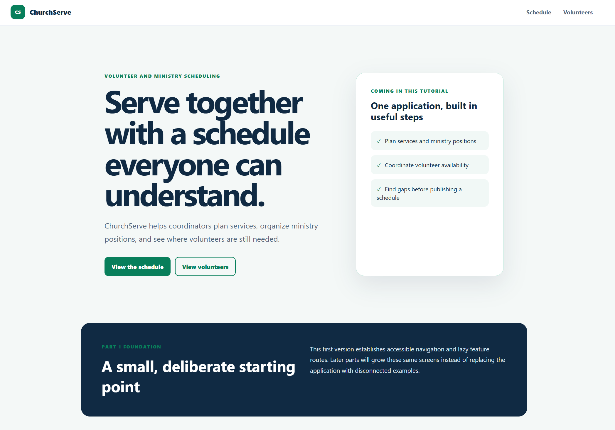
Select Schedule and Volunteers to confirm both lazy routes load their placeholder pages. Then run npm test -- --watch=false; the checkpoint is complete when all three Part 1 tests pass.